Saturday, March 28, 2020

Coronavirus projections: model 2

Thanks for the positive response to our initial work on a COVID-19 prediction model.  Here are the results of a second iteration in model development.  If you are a Dynochem user, you can also download and run the model from our COVID-19 site.

A challenge with predictions for the outbreak is that we only have reported/ known case data for parameter estimation.  The first model assumed that all infected cases would ultimately be known cases and that detected cases were equivalent to reported known case data.  In our updated model today, detected cases are no longer simply a lag of infected cases but use the fact that a significant portion of infected cases are never reported in known case data.

The fraction that defines this relationship was estimated in recently published analysis of the outbreak in China; using a complex model that included movement between Chinese cities, known cases were estimated to represent only 14% of the total; however they also estimate that the ability to transmit the disease in unknown cases was 55% of that in known cases.  It is difficult to see why an unknown case would be less infectious.  If we assume that all infectious are equally infectious (on average) whether their case is known or not, this leads to an estimate that about 22% of cases are known based on the China data.  We have also taken estimates of the incubation period and infectious period from the China data.

To account for the above treatment of known cases for parameter estimation, the predictive model now includes the following elements:
This is similar to what is known as the SEIR model, except that here the 'Recovered' compartment is split into Isolated and Cured, for the purposes of estimating ICU capacity requirements. We have not included mortality calculations. The concept of known cases (cumul_detected) is linked to the number of infected by the above fraction (test_frac=22%) and the time from test request to test result.  The 5% requirement for ICU beds is 5% of known cases.  Model assumptions are noted on the Process Scheme worksheet together with some notes about possible future changes.  The model includes a Notes tab explaining how to apply it to a specific region.

We have applied the model to both Ireland and Italy today and results are shown below.
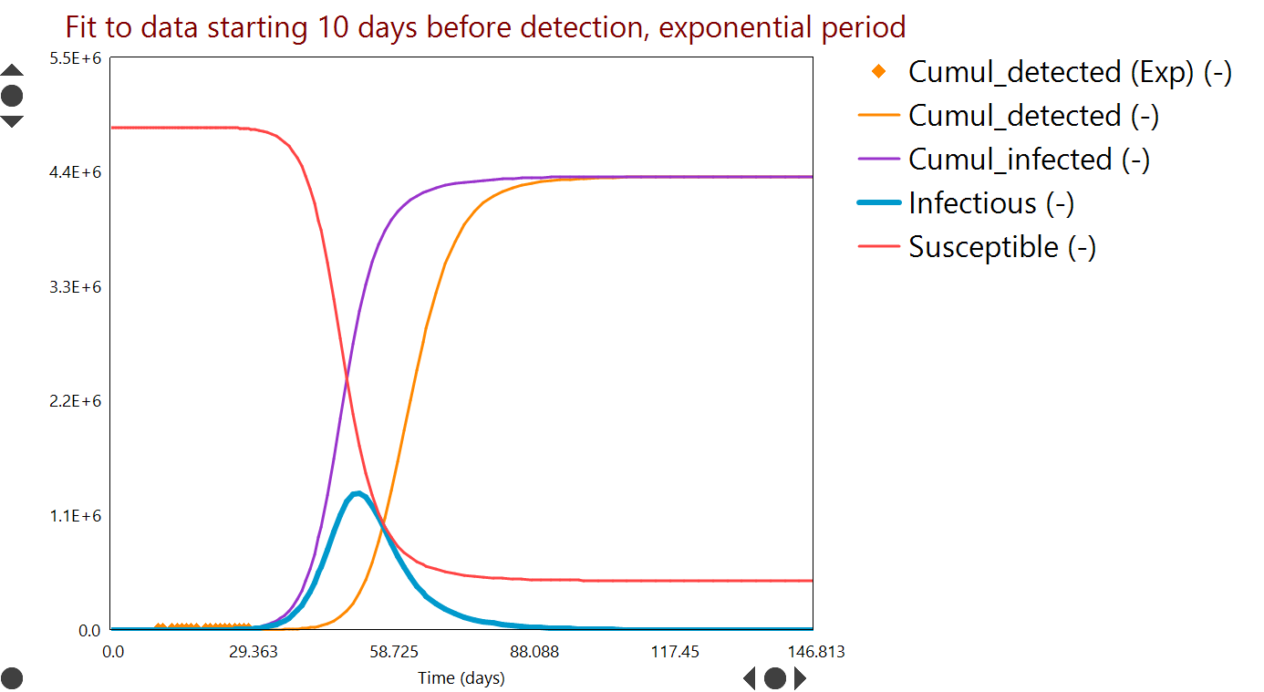
Model 2 fit for Ireland data, with timeframe to end March 2020 (Day 0 = February 20).
Curves are model predictions and symbols are observed data.  Plot units are in brackets on the legend.
There is a clear indication of how measures have changed the trend in the numbers Exposed and Infectious.
Potential impact of on/off restrictions in movement for Ireland to end December 2020.  With further limits on people movement [inset], peak ICU needs could be reached in April or June, depending on restrictions.
The (future) predictions in both cases for Ireland and Italy are optimistic in that they assume a further tightening or increased effectiveness of social distancing / restrictions, compared to what we have been able to achieve to date, plus repeated application of those measures for months ahead. There is evidence that Italy has reduced contact to 40% of base level, while Ireland has reduced contact to 50% to date; these levels are indicated by the 'mixing' variable in the model (see inset plots).  The economic and other costs associated with continuation and deepening this regimen (e.g. to 20% or 10% contact) may not be sustainable.  To generate additional predictions with alternative timing and extent of measures, download the model and run this scenario with your own inputs.
Model fit for Italy data, with timeframe to end March 2020 (Day 0 = February 12).
Curves are model predictions and symbols are observed data.  Plot units are in brackets on the legend.
Potential impact of on/off restrictions in movement for Italy to December 2020.  With further limits on people movement [inset], peak ICU needs could be reached around the end of April (day 77 for Italy).  Relaxation of restrictions even for a short period could return demand towards peak levels.
To drill down further and run your own scenarios, download the model and run it.

In addition to challenges interpreting known case data, the number of data available are also limited, therefore model parameters are uncertain and predictions are indicative only.  In particular, the R0 parameter we obtain by parameter estimation to known case data is 3.0 for Italy and 3.55 for Ireland, both higher than values generally quoted for China.  This could reflect differences in social contact patterns, age profile or the importation of cases due to air travel, which are not explicitly included in our model.  Both values being higher than China may be an artifact of having too few data at present and makes the current model predict more severe impacts.

Monday, March 23, 2020

Coronavirus projections

We built a model over the last week using our Dynochem platform that analyzes reported case numbers and projects forward to the peak(s) of the outbreak, allowing interactive exploration of the effectiveness and timing of measures that could be implemented.  This model may be applied to the specific situation in any country or region, by fitting two parameters to case data for that region from the ECDC. You can get a copy of the model here; to run it, you'll need Dynochem installed.  In recent days some nice online simulators have also appeared and here is one example.

The current Dynochem model tracks the number of susceptible, infectious, isolated and cured patients versus time.  Detected cases are tracked, with a time lag after infection that reflects both the induction period and rate of testing.  The rate of growth is fitted to regional data for detections (cumulative).
Schematic of current Dynochem model for Covid 19 outbreak [click to expand]
The effect of reduced movement/ contact of citizens is included as a mixing parameter, ranging from 1.0 with free movement to 0.0 with no movement at all.  [Because infection behaves like an un-premixed chemical reaction, classical chemical engineering concepts like intensity of segregation are relevant and the rate of reaction depends quite linearly on the number of infectious people that are moving around/ mixing.]

The Dynochem model assumes that all detected cases are isolated after detection and are no longer able to infect others; this is the current policy of health authorities.  However the number of actual infected cases in the early period can be many times more than those detected, so most of the infectious may be moving through the community when no restrictions are in place.

Parameters estimated from case data are i) the initial number of infectious cases 10 days before the first detected case and ii) the kinetic constant for growth of the outbreak during the exponential phase.  The predictions should be taken as indicative and useful for planning rather than definitive.  One can argue about methodology and assumptions and we may be able to take a more definitive approach when more data become available.

A typical fit to detection data (for Ireland in this case) is shown in Figure 1.
Figure 1: Parameter fit to case numbers.  Curves are model predictions versus time; symbols are measured data [click to expand]. 
Future case numbers can be predicted as shown in Figure 2, for a scenario in which people movement is unrestricted (worst case) and an example period of about 150 days.  The peak number of infectious (blue curve) could have been over 1.3 M without restrictions.
Figure 2: Worst case projected numbers of infectious people (blue) versus time, based on early case data and without restrictions on the movement or people [click to expand].
'R0' terminology from the field of epidemiology is used to characterize the contagiousness of the spread. We explored the sensitivity to this variable [a property of the disease] as well as the degree of social contact / mixing [a property of how we respond].  In epidemiology these are often multiplied to give an 'effective R'.

Simulations like that in Figure 2 may be run many times over with different inputs; an example result from a series of about 300 such 'scenarios' is summarized in Figure 3.  The parameters varied are the contagiousness (R0, on y-axis) and the degree of people movement (mixing, on x-axis).  The example response plotted as a heat map is the number of people that would ultimately be infected.
Figure 3: Contour levels / colours indicate the number of people that could be infected, versus contagiousness (y-axis) and people movement (x-axis) [click to expand].
Figure 3 indicates, taking the fitted R0=3 (at bottom of plot) as the most likely case, that most of the population could be infected in a worst case scenario (mixing=1).

Additional results available include the timing of the peak (or peaks) in case numbers and the number of hospital beds required to accommodate patients.  The mixing variable can also be imposed as a profile versus time, so that various on/off strategies for people movement can be considered.  For example Figure 4 shows what may be an optimistic simulation of the effect of two periods of almost fully restricted movement, designed to reduce the number of infectious to near zero.
Figure 4: Infection rate and beds needed (assuming 5% of isolated patients require hospitalization) when two periods of very restricted movement are applied several months apart [click to expand].
There is evidence from Ireland and several other European countries that recent restrictions are starting to slow the rate of infection.  The model indicates that restrictions of varying degrees may be required over an extended period.

We intend to update the model and its predictions here periodically with new data.

ShareThis small