We built a model over the last week using our Dynochem platform that analyzes reported case numbers and projects forward to the peak(s) of the outbreak, allowing interactive exploration of the effectiveness and timing of measures that could be implemented. This model may be applied to the specific situation in any country or region, by fitting two parameters to
case data for that region from the ECDC. You can get a copy of the model
here; to run it, you'll need
Dynochem installed. In recent days some nice online simulators have also appeared and here is
one example.
The current Dynochem model tracks the number of susceptible, infectious, isolated and cured patients versus time. Detected cases are tracked, with a time lag after infection that reflects both the induction period and rate of testing. The rate of growth is fitted to regional data for detections (cumulative).
 |
| Schematic of current Dynochem model for Covid 19 outbreak [click to expand] |
The effect of reduced movement/ contact of citizens is included as a mixing parameter, ranging from 1.0 with free movement to 0.0 with no movement at all. [Because infection behaves like an un-premixed chemical reaction, classical chemical engineering concepts like
intensity of segregation are relevant and the rate of reaction depends quite linearly on the number of infectious people that are moving around/ mixing.]
The Dynochem model assumes that all detected cases are isolated after detection and are no longer able to infect others; this is the current policy of health authorities. However the number of actual infected cases in the early period can be many times more than those detected, so most of the infectious may be moving through the community when no restrictions are in place.
Parameters estimated from case data are i) the initial number of infectious cases 10 days before the first detected case and ii) the kinetic constant for growth of the outbreak during the exponential phase. The predictions should be taken as indicative and useful for planning rather than definitive. One can argue about methodology and assumptions and we may be able to take a more definitive approach when more data become available.
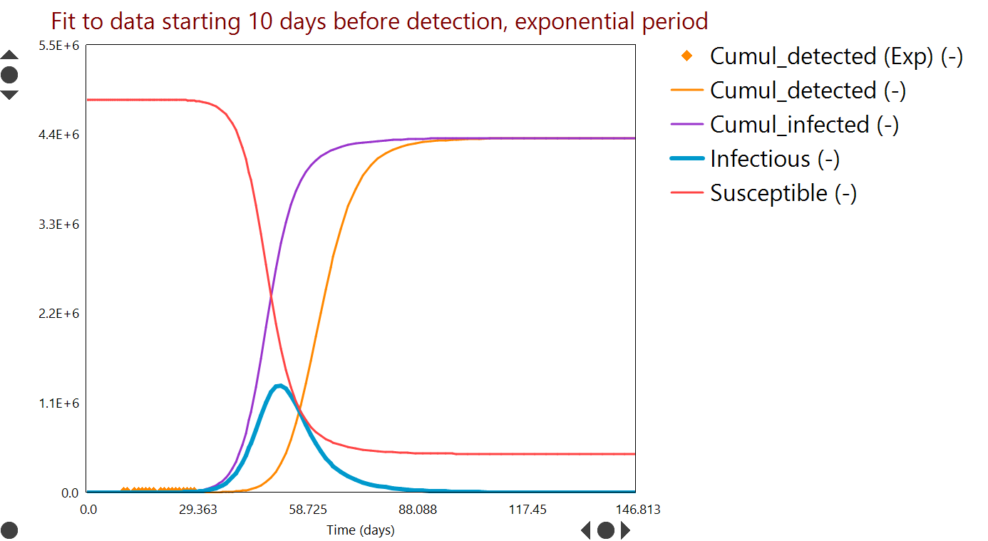
A typical fit to detection data (for Ireland in this case) is shown in Figure 1.
 |
| Figure 1: Parameter fit to case numbers. Curves are model predictions versus time; symbols are measured data [click to expand]. |
Future case numbers can be predicted as shown in Figure 2, for a scenario in which people movement is unrestricted (worst case) and an example period of about 150 days. The peak number of infectious (blue curve) could have been over 1.3 M without restrictions.
 |
| Figure 2: Worst case projected numbers of infectious people (blue) versus time, based on early case data and without restrictions on the movement or people [click to expand]. |
'R0' terminology from the field of epidemiology is used to characterize the contagiousness of the spread. We explored the sensitivity to this variable [a property of the disease] as well as the degree of social contact / mixing [a property of how we respond]. In epidemiology these are often multiplied to give an 'effective R'.
Simulations like that in Figure 2 may be run many times over with different inputs; an example result from a series of about 300 such 'scenarios' is summarized in Figure 3. The parameters varied are the contagiousness (R0, on y-axis) and the degree of people movement (mixing, on x-axis). The example response plotted as a heat map is the number of people that would ultimately be infected.
 |
| Figure 3: Contour levels / colours indicate the number of people that could be infected, versus contagiousness (y-axis) and people movement (x-axis) [click to expand]. |
Figure 3 indicates, taking the fitted R0=3 (at bottom of plot) as the most likely case, that most of the population could be infected in a worst case scenario (mixing=1).
Additional results available include the timing of the peak (or peaks) in case numbers and the number of hospital beds required to accommodate patients. The mixing variable can also be imposed as a profile versus time, so that various on/off strategies for people movement can be considered. For example Figure 4 shows what may be an optimistic simulation of the effect of two periods of almost fully restricted movement, designed to reduce the number of infectious to near zero.
 |
| Figure 4: Infection rate and beds needed (assuming 5% of isolated patients require hospitalization) when two periods of very restricted movement are applied several months apart [click to expand]. |
There is evidence from Ireland and several other European countries that recent restrictions are starting to slow the rate of infection. The model indicates that restrictions of varying degrees may be required over an extended period.
We intend to update the model and its predictions here periodically with new data.


No comments:
Post a Comment